

Seeking the story
Where to start when you need inspiration
Keeping on top of the news is often a great way of familiarising yourself with the kind of data that's out there, the current topics of interest, and where other interesting stories might lie.
In this set of challenges, we will 'reverse engineer' a story from the Guardian to work out how they reached their conclusions - and to explore other ways they could have extended their story.
=====
In January 2011, the Guardian Datablog ran a story about global carbon dioxide emissions.
Using emssions data, they created the following visualisation:
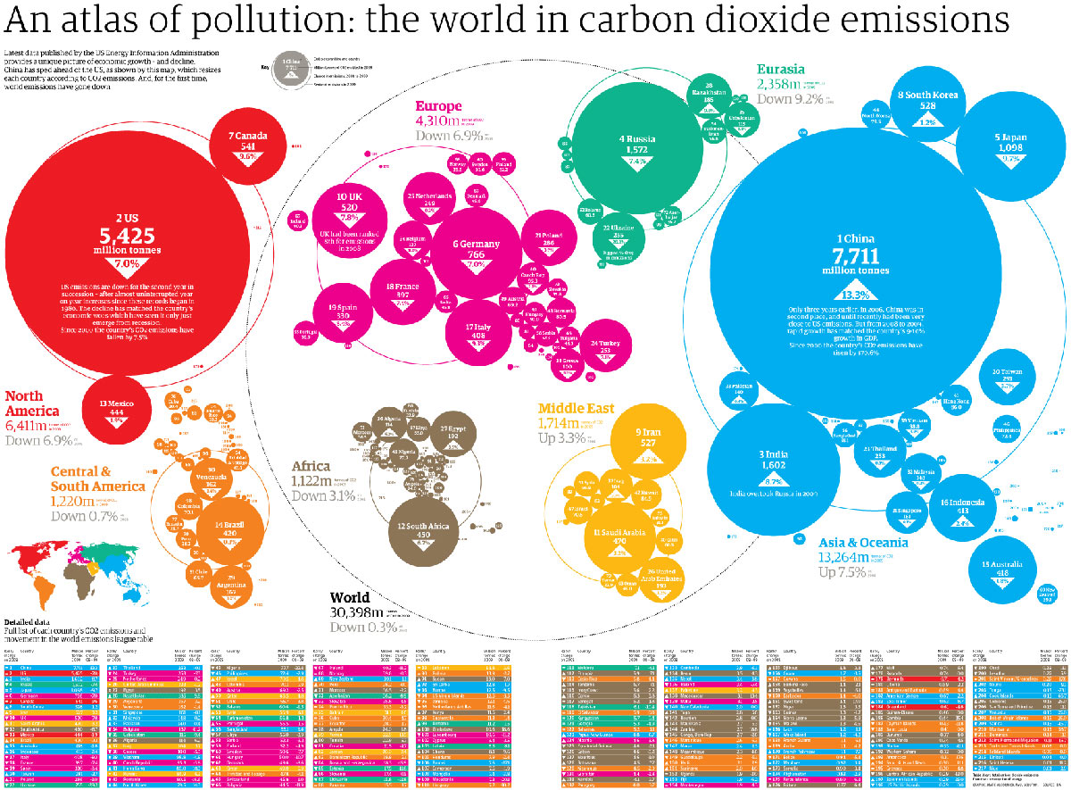
Their tagline was 'China speeds ahead of the rest'. Which is true. But it doesn't tell the full story - can you see why?
The visualisation above *ONLY* shows emissions per country - it doesn't take into account the size of the populatoin.
To give a more accurate picture of the data, the Guardian had to mash the emissions data they had found with popluation statistics. When the two datasets were combined, they could look not only at 'total' CO2 emissions, but also at CO2 emissions per capita.
What other datasets might have given an interesting angle on this story? Brainstorm, and share your ideas below.
Often, imagining what kind of data might reveal an interesting story is one of the hardest parts of being a data wrangler. The more familiar you become with the kinds of data that exist, the more creative you will be! Sharing ideas with other Data Wranglers can also help.