This course will become read-only in the near future. Tell us at community.p2pu.org if that is a problem.

Block Elements


There are several primary block elements used in HTML5. We will look at some new and old tags that complement the <head> and <body> duo.

  • <header>
  • <nav>
  • <article>
  • <aside>
  • <footer>
  • <blockquote>


<header>

The <header> tag is a container for introductory materials in a document or section. <header> can be used multiple times in a document and usually contains at least one <h1>-<h6> element (in order to validate).

<header>
  <h1>Section/Document Header</h1>
  <p>A brief description of this section/document</p>
</header>

Further reading:

<nav>

The <nav> tag is used to demarcate a section containing navigation anchors (links) to other content or sections. The anchors can be nested within a list such as an unordered list <ul>.

<nav>
  <h1>Navigation</h1>
  <ul>
    <li><a href="#home">Home</a></li>
    <li><a href="#contact">Contact Us</a></li>
  </ul>
</nav>

Further reading:


<article>

The <article> tag designates a region of a document that is self-contained. <article> can be an article, blog post, news story, etc.

<article>
  <img src="image.webp" alt="An image." />
  This is the content for the article.
</article>

Further reading:

<aside>

The <aside> tag contains information that is tangentially related to to the primary content. Examples can include anecdotes, sidebars, external links, keyword definitions, etc.

<article>
  <p>This is an article HTML5</p>
  <aside>
    HTML5 is often used in conjunction with CSS and JavaScript. 
  </aside>
</article>

Further reading:

<footer>

The <footer> element is located at the end of a content section, such as <html>, and will contain information including licensing details, addresses and contact information,  and links to site-wide documents such as a community aggreement.

<html>
  <article>Article content.</article>
  <footer>
  Creative Commons license.
  </footer>
</html>

Further reading:

<blockquote>

The <blockquote> tag is used to indicate a quotation or citation. The cite attribute is used within a <blockquote> tag to reference the origin of the quote.

<blockquote cite="Caleb">on the last element you listed 'bockquote', should be blockquote</blockquote>

Further reading:

Task

  1. Put together a news article using each of the above tags and any tags described in previous tasks.
  2. Post a link to your news article in the discussion area below.
  3. Be sure to review each others' news articles and comment on techniques and content as desired :-)

Hint: Use the following diagram as an example of how block elements are nested.

Note: CSS is required to obtain the layout in the following diagram.
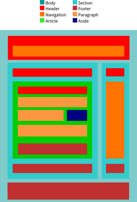
HTML5 Block Elements

Task Discussion


  • Motlar   July 27, 2012, 6:16 a.m.

    My page for the Block Elements task: https://thimble.webmaker.org/p/8n1

  • caroline   July 19, 2012, 7:19 p.m.

    woohoo!

    http://htmlpad.org/p2pu-blockelements/


    I still couldn't figure out how to tweak the CSS so that the gray box of the right section extends to the bottom footer, but oh well, it sort of looks like an article :)

  • seefoosam   Aug. 26, 2012, 11:19 p.m.
    In Reply To:   caroline   July 19, 2012, 7:19 p.m.

    Why did you insert this  "http-equiv="Content-Type" into your head? I tried to find what it was for but could not find a good answer. I was just putting this in "  <meta charset="utf-8">  ".


    Thanks :)

  • khaosstar   July 16, 2012, 7:47 p.m.

    My craptastic page: http://htmlpad.org/afkhde/

  • chinnan   July 7, 2012, 11:25 a.m.
  • hamilton mena quejada   June 23, 2012, 9 p.m.

    Espero comentarios, sugerencias y cualquier critica que me permita mejor lo que va a ver.

    http://htmlpad.org/alanturing/

  • Alex   June 16, 2012, 5:05 p.m.

    mine: htmlpad.org/alexitc

    seems weird we're expected to know CSS

  • khaosstar   July 15, 2012, 8:23 a.m.
    In Reply To:   Alex   June 16, 2012, 5:05 p.m.

    I know I'm late in responding, but I just got to this task today. I don't think we have to use CSS, they were only saying that CSS is needed to get the layout that they showed above.

    Even so, it looks like everyone went ahead with CSS, so I'll be using it on my assignment as well...

  • Toss   May 31, 2012, 6:36 p.m.

    Here's my homework...anyone interested in the new macbook pro Check it

  • Anonym   Aug. 3, 2012, 3:02 p.m.
    In Reply To:   Toss   May 31, 2012, 6:36 p.m.

    You did not add a title to your html page. I added one for you, just now, so all is good. 

  • Giorgos Dimop   May 31, 2012, 9:03 a.m.
  • JoshM   May 13, 2012, 8:36 p.m.

    It took way longer than expected! 


    http://htmlpad.org/webelementsblock/

  • WolfGirl   May 12, 2012, 2:20 p.m.
  • Nick   May 6, 2012, 7:52 a.m.

    Here is my block elements page.

  • Al   May 10, 2012, 8:02 p.m.
    In Reply To:   Nick   May 6, 2012, 7:52 a.m.

    The <aside> element wasn't working right for me, I checked out the soure of your page and saw what I was doing wrong.

    +1 to you!

  • Pau Company   April 23, 2012, 7:48 a.m.
  • berenhena   April 30, 2012, 11:36 a.m.
    In Reply To:   Pau Company   April 23, 2012, 7:48 a.m.

    Me gustó mucho cómo te quedó cheeky

  • Pau Company   April 30, 2012, 11:47 a.m.
    In Reply To:   berenhena   April 30, 2012, 11:36 a.m.

    Muchas Gracias. Si te puedo ayudar en algo, ya sabes como contactarme. Atentamente:


    Pau Company


  • JuanMa Ruiz   March 18, 2012, 12:21 p.m.

    Hi! here's my asignment . I wait your comments.

  • Mr. Plow   March 22, 2012, 7:28 a.m.
    In Reply To:   JuanMa Ruiz   March 18, 2012, 12:21 p.m.

    I think your link has an extra "%20target=" in the href. I removed that and viewed your layout- it looks great! 

  • JuanMa Ruiz   March 22, 2012, 8:17 a.m.
    In Reply To:   Mr. Plow   March 22, 2012, 7:28 a.m.

    Thanks for yours comments. I changed the link and now it works.

  • Mr. Plow   March 14, 2012, 3:43 p.m.

    Here is my effort toward learning to use block-level elements.

    I hijacked lots of CSS to make the layout remotely close to the example but didn't have time to figure out why the articles layout extends all the way to the edge. Also, colors and fonts are ugly and unimaginative, but learning CSS is something that happens later :)

  • alcinoe   Nov. 28, 2011, 9:38 p.m.


    Here's mine.
     
    I had some trouble with the CSS. The border and background around the blockquote are conflicting with the aside. Does anyone know how to fix this? I do not want to float left the paragraph to the left of it - I want the paragraphs to flow around the aside.
     
  • Anonym   Nov. 29, 2011, 12:06 a.m.
    In Reply To:   alcinoe   Nov. 28, 2011, 9:38 p.m.

    I don't know any solution to your problem, but I love the color and style.  You have such a good sense of colorsyes 

  • alcinoe   Nov. 29, 2011, 6:50 a.m.
    In Reply To:   Anonym   Nov. 29, 2011, 12:06 a.m.

    Thank you, Demian.

  • Vita   Nov. 29, 2011, 11:22 a.m.
    In Reply To:   alcinoe   Nov. 28, 2011, 9:38 p.m.

    Did you try to put the <aside> after the <blockquote>...? Dont know really, might help but I'm not sure... The overall layout and colors look great by the way...smiley

  • Indie Media Project   Nov. 30, 2011, 7:03 p.m.
    In Reply To:   Vita   Nov. 29, 2011, 11:22 a.m.

    If you remove the <p> tags within the <aside> part it should fix it although you shouldn't have to so I'll try and find a better solution.

  • Indie Media Project   Nov. 30, 2011, 7:12 p.m.
    In Reply To:   alcinoe   Nov. 28, 2011, 9:38 p.m.

    If you apply "overflow: hidden;" to "blockquote" in your CSS it also works.

  • alcinoe   Nov. 30, 2011, 8:59 p.m.
    In Reply To:   Indie Media Project   Nov. 30, 2011, 7:12 p.m.

    Thank you very much, Indie. It worked perfectly!

    Elizabeth

  • Vijayendra   Nov. 28, 2011, 12:24 p.m.

    I have added my work with Block Elements at the following link  http://htmlpad.org/Html5-NewsArticle-Layout/ 

  • Anonym   Nov. 28, 2011, 5:53 p.m.
    In Reply To:   Vijayendra   Nov. 28, 2011, 12:24 p.m.

    Nice layout smiley  Good job!

  • alcinoe   Nov. 28, 2011, 9:32 p.m.
    In Reply To:   Vijayendra   Nov. 28, 2011, 12:24 p.m.

    It looks very nice, Vijayendra.

  • Vijayendra   Nov. 30, 2011, 11:05 p.m.
    In Reply To:   Anonym   Nov. 28, 2011, 5:53 p.m.

    Thanks, you liked it..smiley

  • WolfGirl   May 11, 2012, 2:47 p.m.
    In Reply To:   Vijayendra   Nov. 28, 2011, 12:24 p.m.

    Stunning!

  • Vita   Nov. 28, 2011, 5:31 a.m.

    Here's my example for Block Elements, I made a news page with the given layout. Check it out and tell me what do you think... wink

    http://dl.dropbox.com/u/18761433/HTML5Course/blockelements.html

  • Anonym   Nov. 28, 2011, 5:48 p.m.
    In Reply To:   Vita   Nov. 28, 2011, 5:31 a.m.

    Nice work, but the text runs outside.  I attach the screen shot of your page in FireFox.

    http://dl.dropbox.com/u/49688808/Screenshot.png

  • alcinoe   Nov. 28, 2011, 8:59 p.m.
    In Reply To:   Vita   Nov. 28, 2011, 5:31 a.m.

    Nice Job. It looks fine for me - Firefox 7.0.1 on Windows. 

  • alcinoe   Nov. 28, 2011, 9:04 p.m.
    In Reply To:   alcinoe   Nov. 28, 2011, 8:59 p.m.

    I just updated to Firefox 8.0.1 and it still looks fine

  • Anonym   Nov. 28, 2011, 9:09 p.m.
    In Reply To:   alcinoe   Nov. 28, 2011, 9:04 p.m.

    I use FireFox 8 also.  How come it doesn't come out fine for me?....  Have you tried all tags?

  • Vita   Nov. 29, 2011, 3:22 a.m.
    In Reply To:   Anonym   Nov. 28, 2011, 9:09 p.m.

    I may have an idea of the problem, trying to fix it now, will let you know after, thanks you guys!

  • Vita   Nov. 29, 2011, 4:55 a.m.
    In Reply To:   Vita   Nov. 29, 2011, 3:22 a.m.

    Ok, so... Coming back to my news page I found the mistake that I made - I've put fixed heights on my <p>'s and that might be the reason for text to run out of the paragraph area. I am also using FF8 on Windows, but I am also working on Windows8 Developer Preview and this is not the first time when I am having this kind of difference. Anyways, I also tested the page using Expression Web 4 Super Preview and to me it looks fine in most of the new browsers that support HTML5 new elements.

    I would realy appreciate if you could try to look at it again and let me know if my fixed heights for paragraphs was the problem and if it is looking better now.

    Thank You,

    Vita.

  • Anonym   Nov. 29, 2011, 9:37 a.m.
    In Reply To:   Vita   Nov. 29, 2011, 4:55 a.m.

    Great job fixing, Vita!  Your page looks perfect now; no more running outyes

  • Vita   Nov. 29, 2011, 11:08 a.m.
    In Reply To:   Anonym   Nov. 29, 2011, 9:37 a.m.

    Thanks Demian. And thank you also for the "bug report"...!!! wink

  • jenEliz   Oct. 20, 2011, 4:33 p.m.

    Task: Either visit my continually updated site: Witches and go to the bottom where the "Articles" area is; OR, go straight to my completion of the task: Witches in the News

    For the CSS code, I followed the page source of a the previous comment that completed the colored table. Also, put my own content in there to make it relevant to the original webpage. I will continue to update both!

    If anyone has any ideas for formatting pictures to fit in an aside (such as my oversized picture...) please let me know (though, I'm assuming this is a more complex CSS task)!

  • skullkandy09   Sept. 1, 2011, 12:25 a.m.

    I dont understand the <nav> and <aside> tags. Does <aside> come inside the article tag or <p> tag or what? And where does the <nav> tag come? Sorry if my questions are stupid, im only 12 yrs old

  • dtkindler   Sept. 1, 2011, 12:39 a.m.
    In Reply To:   skullkandy09   Sept. 1, 2011, 12:25 a.m.

    I don't have the answer to that question, having only begun this class myself, but wanted to say that those are awesome questions just because you are 12 yrs old. I'm 46 and think that it's great you're taking the initiative to learn HTML 5.

  • joe palmer   Sept. 1, 2011, 10:54 p.m.
    In Reply To:   skullkandy09   Sept. 1, 2011, 12:25 a.m.

    Considering the nav tag, if you did not use it in a saved .html document that you make in your editor and than put on a browser, you will not see any change by using it. However it is important for other “user agents” as they are called now, such as a phone. Note browsers are being called user agents now too.

    Nav is for navigating around a list of choices, such as in a footer like "home" "contact us" "subscribe" where  the user can click a link. If we view source, we notice it where ever the user has some choices to click on, even just one link. Lets talk how to view the source code of a web page just to be sure we are doing that to see what others have done- it is a great way to learn. To view source, go to the select View from the tool bar, and select page source, a new window will open which will show the source code, you cannot change it  unless you are using the free tool called Firebug from Mozilla to use in Firefox. If you had that tool, you could change the HTML, CSS and even the Javascript to see what effect your change would have and you would see what your change looks like, a very powerful learning tool. If you have the newest version of Firefox, you will notice that they removed page source view, what you do now (and I think this works for the older versions also) is you hit the control key, hold and hit the u key (that is called a shortcut, Google shortcut keys and you would find lots of them!)

    When viewing source do not be discouraged at seeing many computer (more correctly software generated) generated code out there. Developers still go into them to make a change to the code that the software is not expressing to the user agent on its own. It is really fun when you view the source of a totally hand written site, such as this one which I picked because it is an educational one for a reader of it- http://themaingate.net/

    He could  have used the nav tag in his listed hrefs, but his purpose is served, it is a beautiful site, we just have to note about anything can usually be better.

    The aside tag is for when you know the content should be aside, or off to the side (not always) of the main content. Here is a guy using it wondering if it is a good way to do something, the conversation is enlightening. http://stackoverflow.com/questions/6109027/can-the-header-tag-be-contained-within-the-aside-tag-in-html5

    Here are some more links about the aside

    http://webdesign.about.com/od/html5tags/p/bltags_aside.htm

    http://diveintohtml5.org/

    This useful link is almost like someone is in the room teaching you!

    http://www.pvmgarage.com/2010/04/touch-the-future-create-an-elegant-website-with-hmtl-5-and-css3/

    I will get to the other question tomorrow, but for now a few things on the keyboard like the copyright symbol do not render or show on a user agent if you use them, so they have special ways of being keyed (typed / written) onto the document.